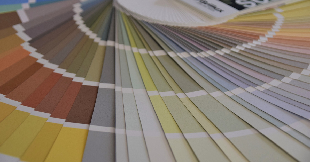
The right colour scheme, design and combination can make a significant contribution to improving the quality of life in care facilities. There are some basic rules that can provide orientation in the choice of colours.
Warm colours
Warm colours have a high yellow content. These include bright red, orange, yellow, yellow-turquoise, yellow-green, olive, brown and beige. They evoke a feeling of warmth in the observer and are therefore used in rooms where a homely atmosphere is important.
Cold colours
Cold colours have a low or no yellow content. Blue-red, indigo, violet, blue-turquoise, blue-green, but also pink, magenta and grey are typical cold colours. These colours convey a sober and matter-of-fact atmosphere. A room in which cold colours predominate appears optically larger to the observer.
Stimulating colours
Colours such as light yellow and grass green provide freshness and liveliness and are particularly suitable for common areas. A strong red can also have a stimulating effect, although this colour can also have a counterproductive effect and is perceived by the occupant as stressful, exhausting.
Soothing colours
Soft blue tones and dark green tones have a calming effect on the observer. This is why we often use these colours in residents‘ rooms. Dark green, for example, is the predominant colour in the resident’s room memoriana, which is suitable for dementia patients. The intensity or degree of saturation of the colours must also be taken into account. In principle, the stronger the colour tone, the more attractive and invigorating it appears
A cauldron of colour – curiosities from the world of colour design
Blue or yellow?
The term blue comes from the Old High German word blao, which can mean both blue and yellow. At first sight this seems absurd. However, it has now been proven that children before the age of two cannot tell the two colours apart. The definition of blue and yellow as separate colour concepts only occurred between 800 and 1000 A.D.
This is not true!
For a long time it was assumed that dogs can only see black and white. This is not true: Dogs can very well distinguish individual colours, but „suffer“ from a pronounced red-green weakness.
Red warms!
In Finland, sales of red socks increase during the winter season. So it not only warms the wool, but also the colour! Don’t you think so? Then you best try it out for yourself!